Nexus mods
- UI
- UX
- Code
- Design system
How a community-driven redesign revolutionised Nexus Mods, enhancing usability, catapulting member engagement, and establishing a new standard in modding platforms.
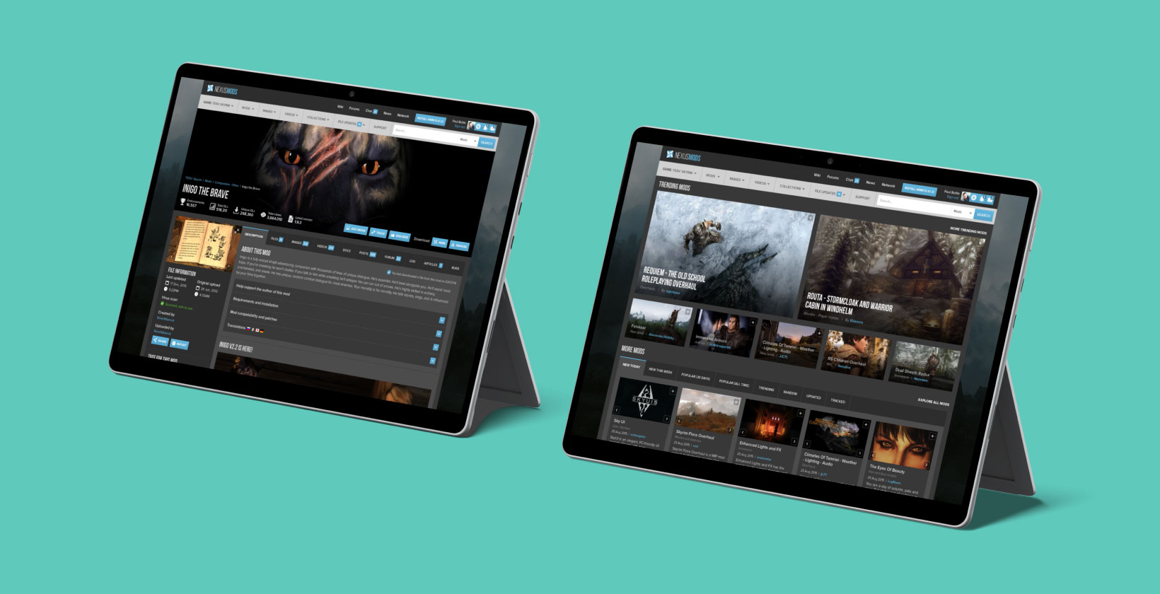
Nexus Mods, a cornerstone in the modding community, faced a significant challenge by 2015: its website was outdated and not user-friendly. My journey with Nexus Mods began when they sought a UI/UX designer who understood their community's needs. As a daily user, I was deeply familiar with the site's issues and passionate about improving it.
This case study outlines how I transformed Nexus Mods from a dated, desktop-only interface into a sleek, intuitive, and responsive platform, significantly contributing to its growth from 9.6 million members in 2015 to 46 million in 2024.
The need for change
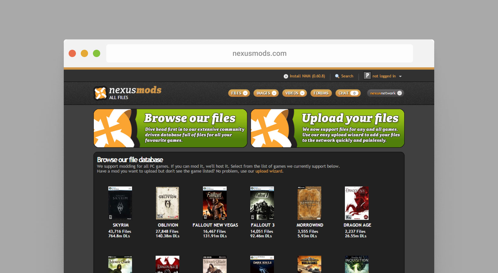
Nexus Mods' website was struggling with several core issues:
- Outdated design, only functional on desktops.
- Poor information architecture and inefficient data organisation.
- Non-user-friendly navigation and search structures.
- Unintuitive mod filtering tools.
- Lack of design and flow consistency, particularly in mod and image uploading processes.
Discovery and analysis
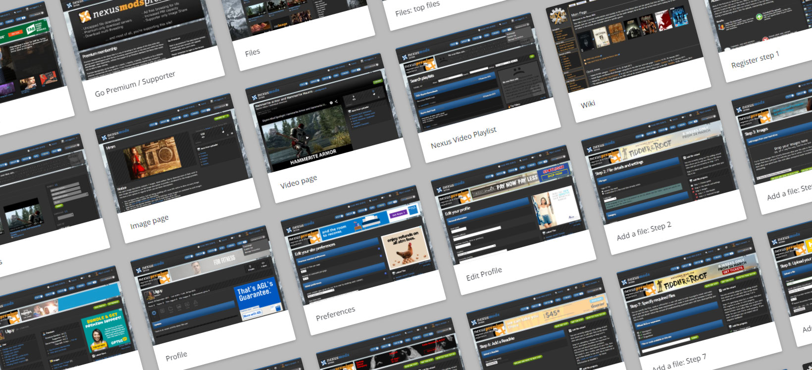
To address these issues, my initial step was an exhaustive 80-page site review via Invision, involving hundreds of active discussions with Nexus Mods staff. This review helped pinpoint specific problems and potential improvements, particularly with user flows. I also utilised heatmaps to identify user pain points and conducted interviews with both Nexus Mods staff and modders (members, uploaders and moderators) to gain a comprehensive understanding of user needs.
Concept Design
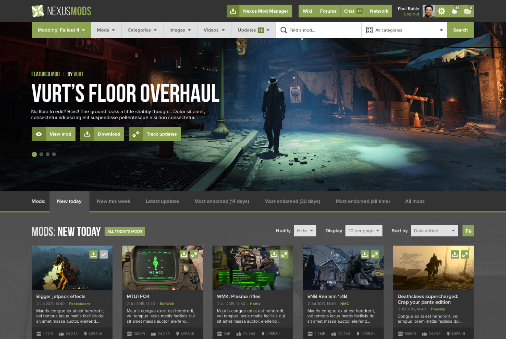
In the early stages of the redesign, I created a concept design to showcase the potential transformation of the Nexus Mods site. This visualisation was not only a blueprint for the new interface but also served as a crucial communication tool. It aligned the team and stakeholders on the envisioned direction and facilitated discussions around specific design elements and user experience enhancements.
High fidelity wireframes
During the wireframes phase, I addressed several key user experience challenges. A prominent issue was the color scheme, particularly the use of grey text on a blue background, which compromised readability. My approach involved introducing higher contrast color combinations, greatly enhancing the site's visual accessibility and user-friendliness, especially for those with visual impairments.
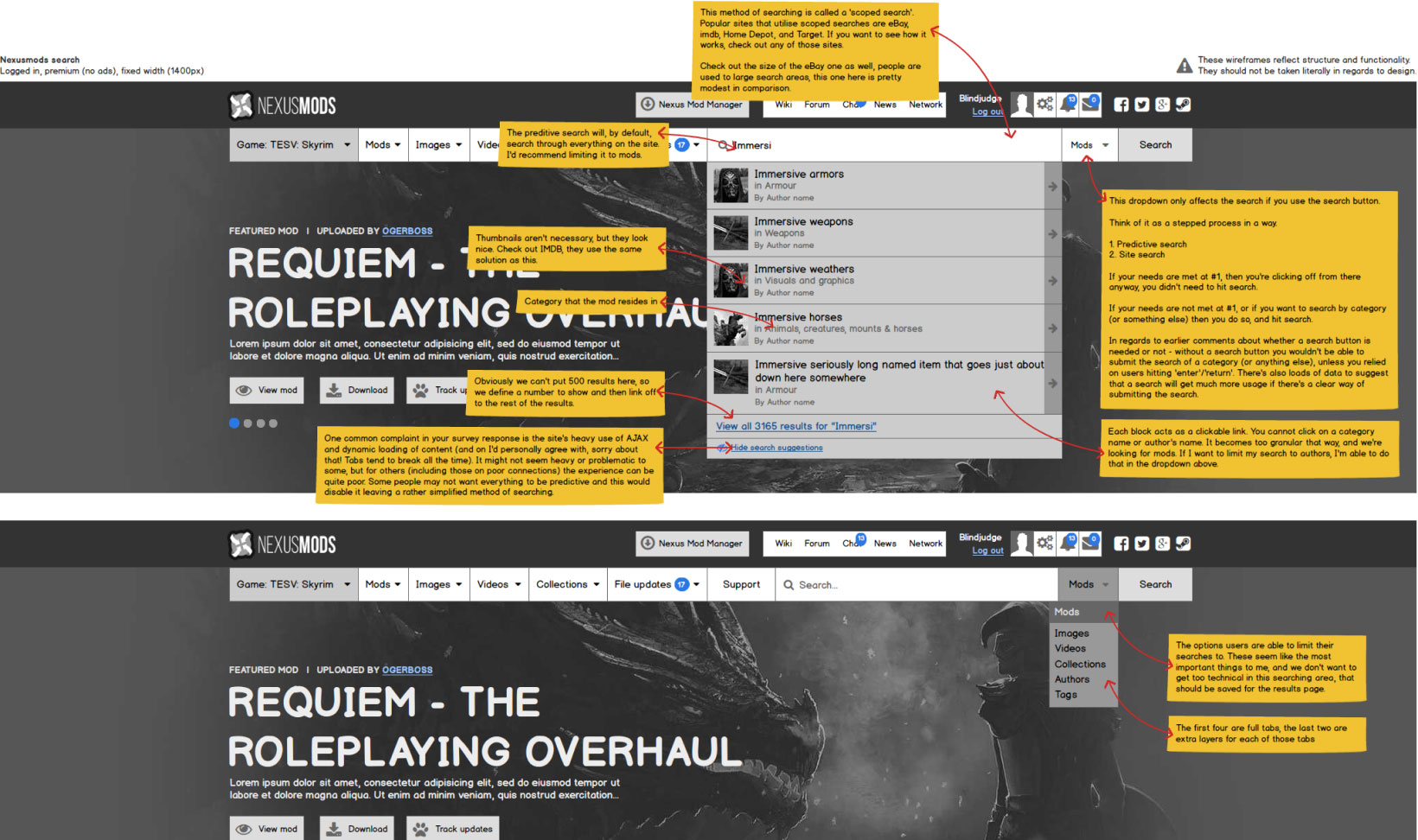
The site's layout initially presented a significant challenge due to its cluttered and unintuitive structure. I focused on reorganising the content to make it more coherent and user-friendly. This was particularly evident in the mod uploading process, which I transformed from a complex sequence of steps into a streamlined, logical flow. This reorganisation significantly improved the overall navigation of the site, making it more intuitive and reducing user frustration.
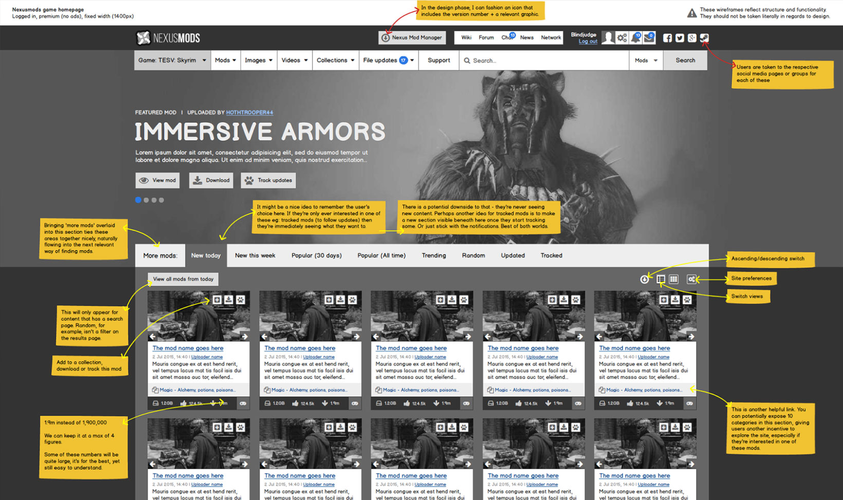
Another critical aspect was customisation. The original design lacked flexibility in how users could interact with the site. To address this, I incorporated features allowing users to personalise their experience, controlling the amount and type of information displayed. This approach not only catered to individual preferences but also acknowledged the diverse requirements of Nexus Mods' extensive community, enhancing the platform's adaptability and appeal.
Finally, improving navigation clarity was essential. For example, the process for adding files in the old design was confusing for users. I focused on creating clear, straightforward navigation paths, ensuring a seamless user journey through the site. This enhancement in navigation clarity played a crucial role in making the platform more user-friendly and efficient. Overall, these targeted efforts in the Nexus Mods redesign were key to transforming the platform into a modern, accessible, and engaging community space.
These improvements and suggestions were part of a 43 page invision document, involving collaboration with myself, Nexus Mods owners and members of the community.
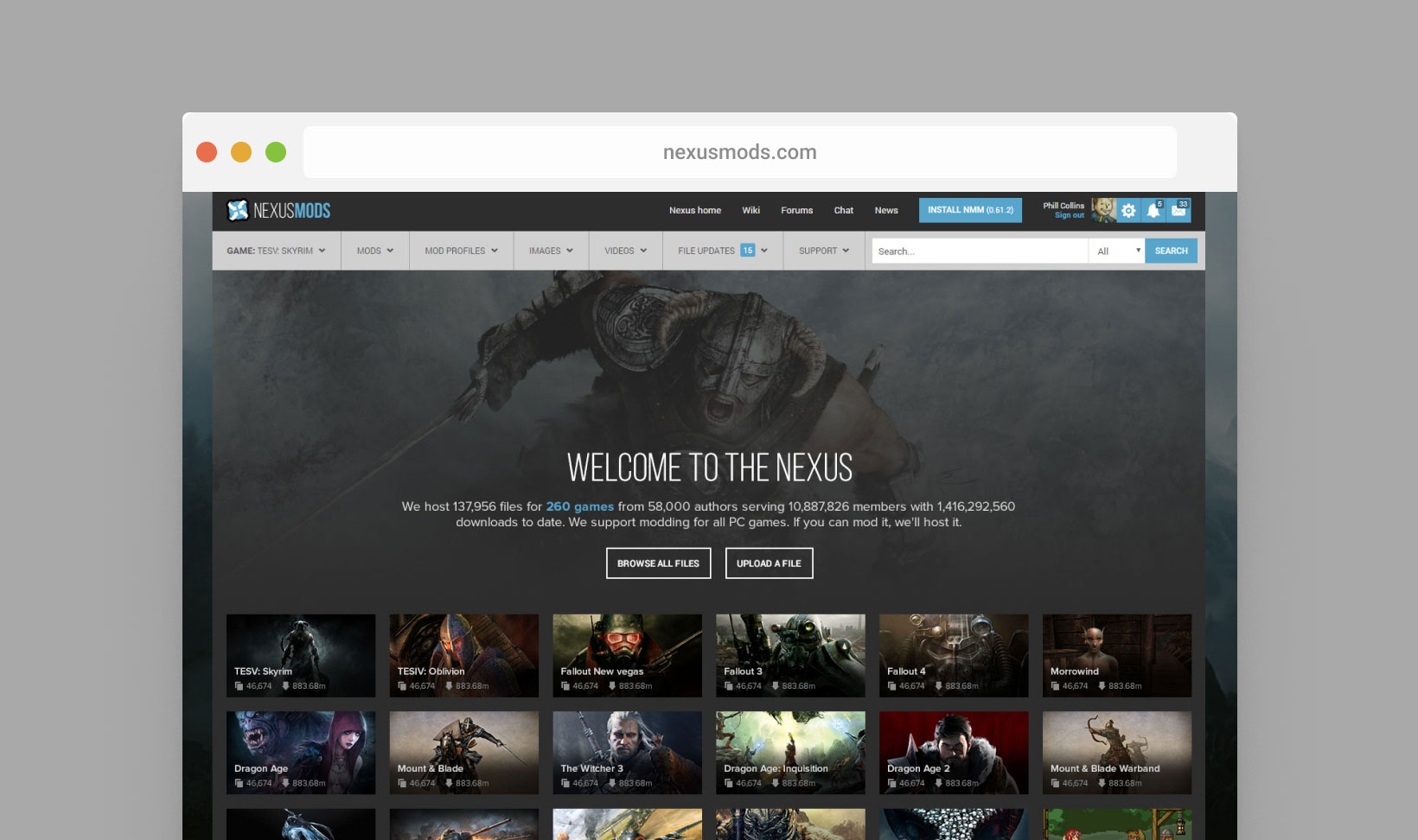
Adding colour to the mix
Comprehensive Redesign and Development
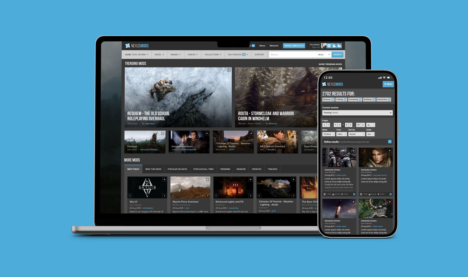
- Developed a fully responsive version of Nexus Mods, ensuring accessibility across desktop, mobile, and tablet.
- Refined the user experience by allowing game browsing, mod tracking, and voting from any device.
- Redesigned every aspect of the site, from visual elements to functional flows, such as media uploads, mod submissions, and the comment system.
- Implemented a new design for Nexus Mod Manager, enhancing user interaction.
- Introduced a tabbed design for mod pages, reorganising data presentation for quicker and more intuitive access.
- Standardised design elements across the platform for consistency.
- Optimised design elements to reflect their purpose more accurately, such as converting certain interfaces to dropdown menus.
- Incorporated more game art and distinct color schemes in each game's modding index page to differentiate mod pages better.
- Redesigned the Nexus Mods Logo: As part of the comprehensive overhaul, I redesigned the Nexus Mods logo. This new logo encapsulated the modern, user-centric vision of the site.
Engagement and Iteration
A crucial aspect of the redesign was constant community engagement. By regularly soliciting feedback, I ensured the new designs were not only aesthetically pleasing but also functionally superior. This approach led to numerous design iterations, each improving the site's usability.
Technical Implementation
Despite initially being hired for design, I took on the front-end development role, crafting HTML, CSS, and JS from scratch. This hands-on approach allowed for seamless translation of design concepts into functional reality.
Impact
User Growth and Engagement
The redesign had a profound impact on user engagement and site growth. The site was now easier to use across more devices, and membership grew from 9.6 million members in 2015, grown to 46 million in 2024.
Conclusion
The Nexus Mods redesign project exemplifies how user-centered design, coupled with deep community engagement, can transform an outdated platform into a thriving, user-friendly hub. This case study demonstrates my commitment to delivering engaging, intuitive, and responsive design solutions that resonate with users.
